THE MARKETING FARM
BRAND IDENTITY
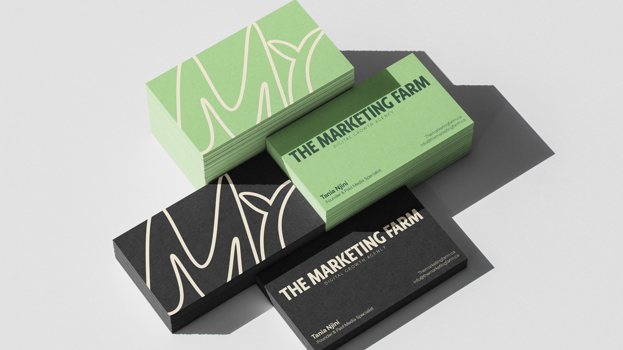
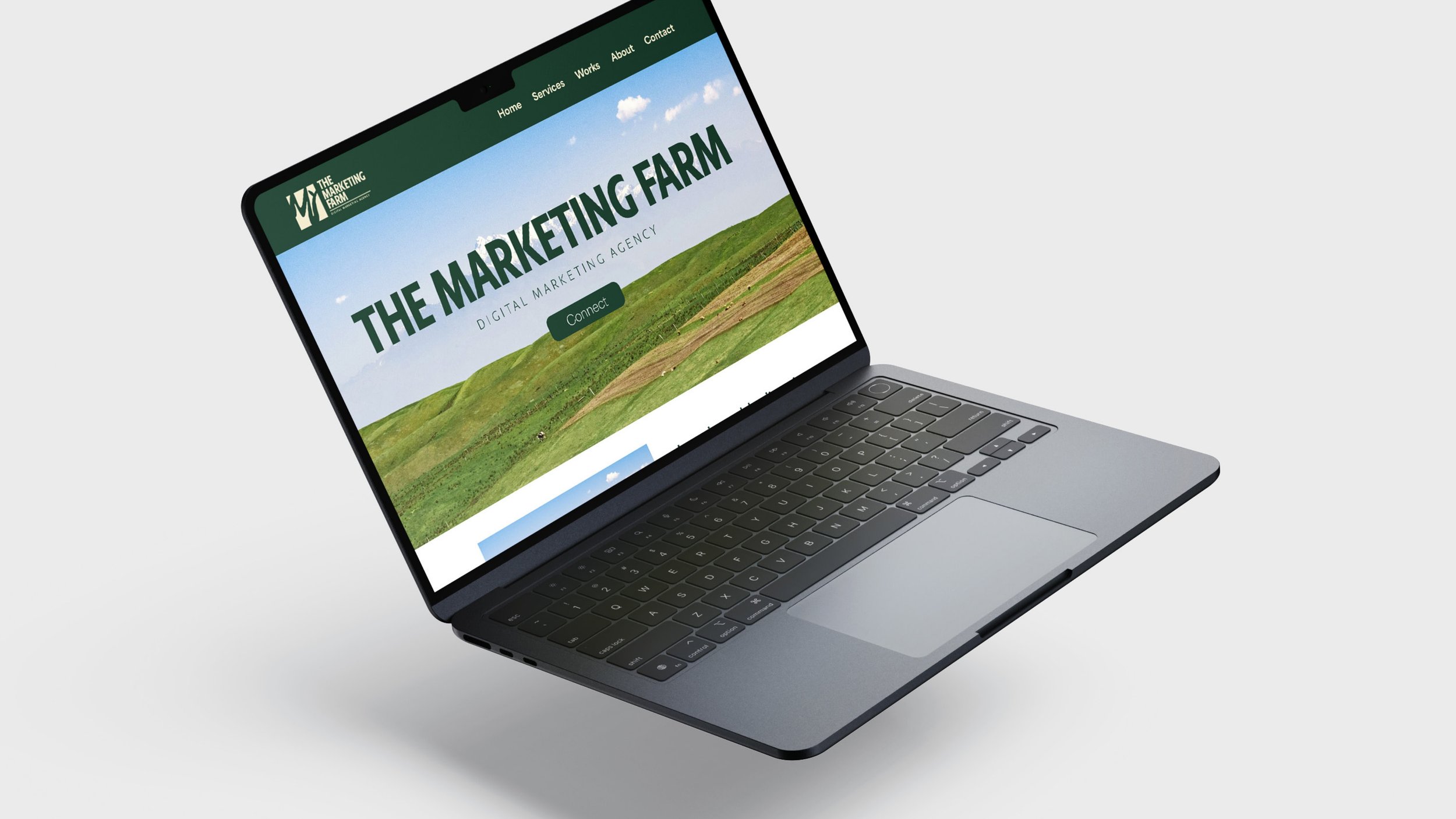
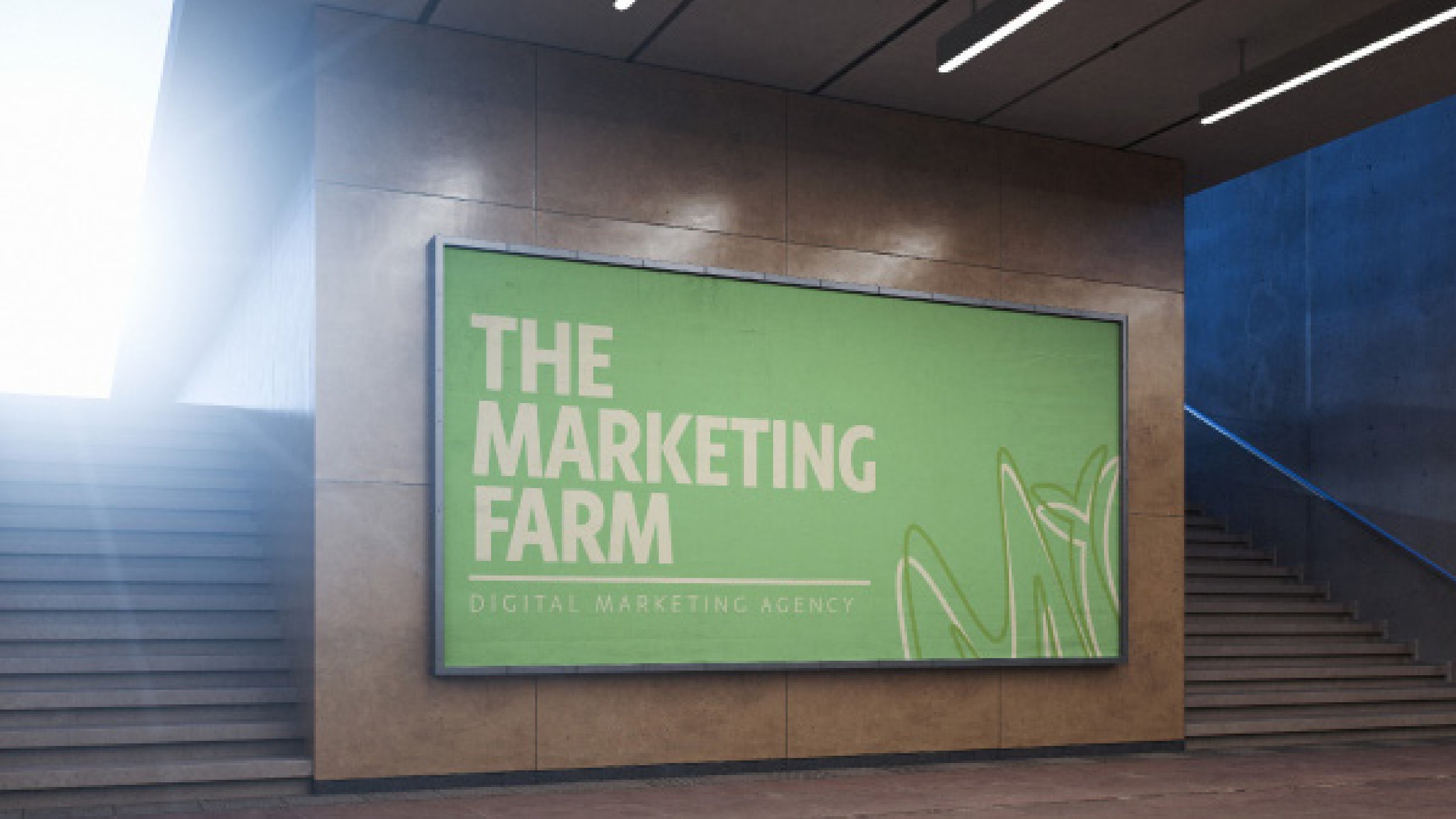
The Marketing Farm brought me on to develop a refreshed brand kit that better represents their evolving identity. I worked closely with the client to maintain and elevate their overall brand presence, with a focus on enhancing their identity. This included designing a new logo, refining the typography system for improved readability and consistency across platforms, and curating a modern, cohesive color palette that captures the brand’s personality.