NO FLUKES
BRAND IDENTITY
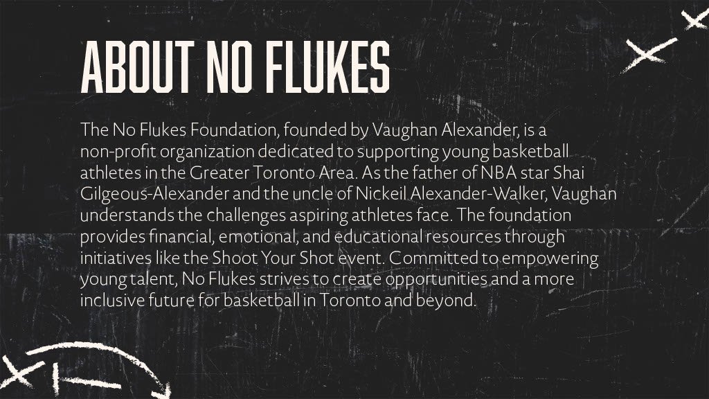
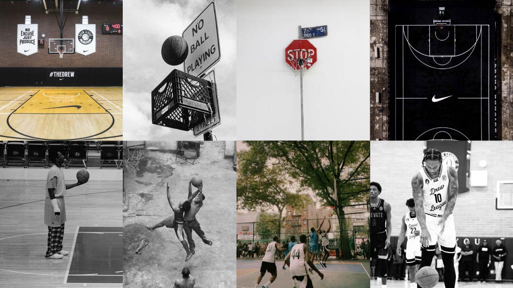
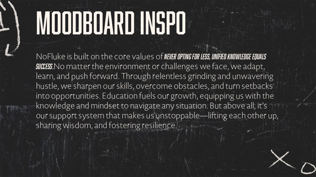
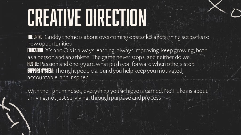
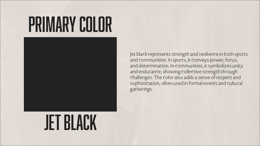
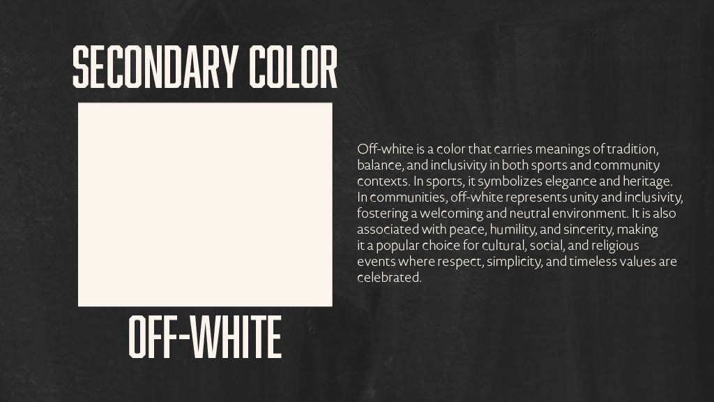
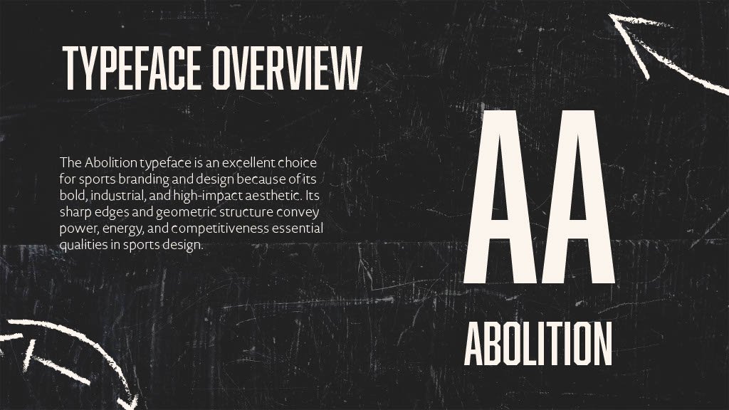
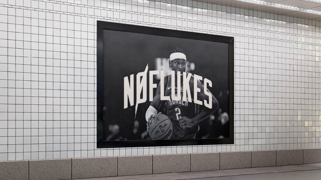
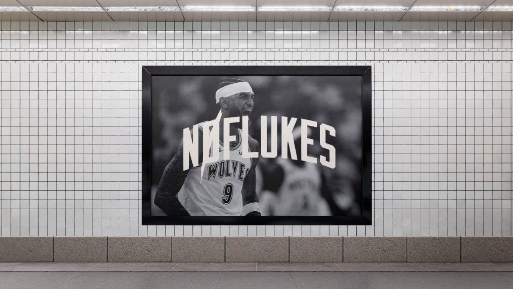
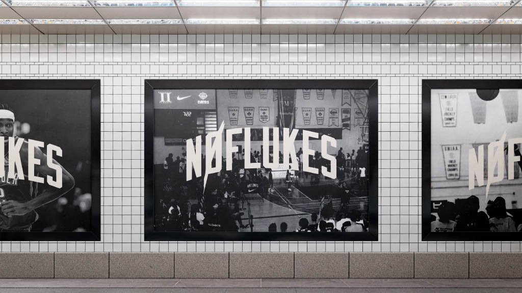
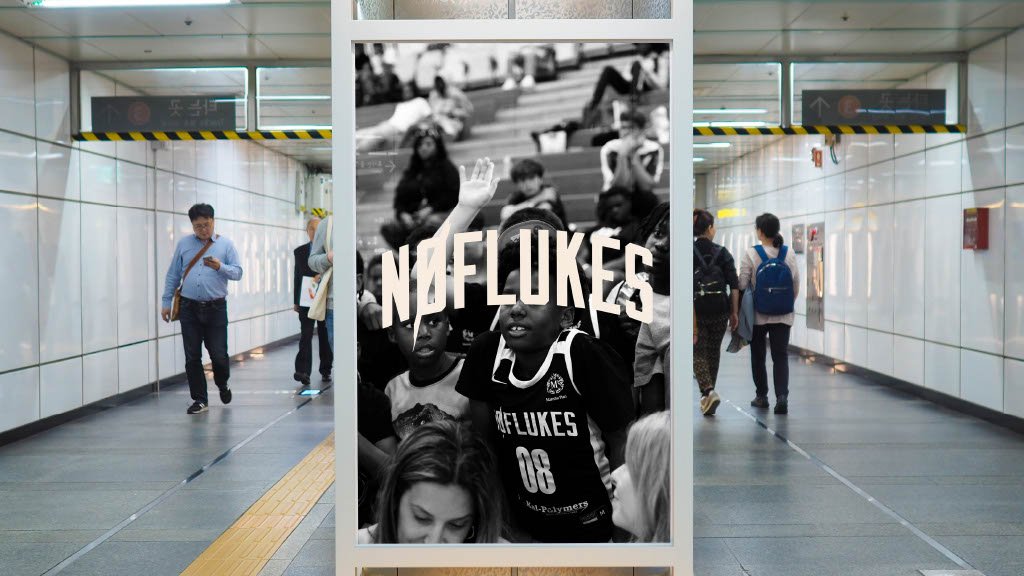
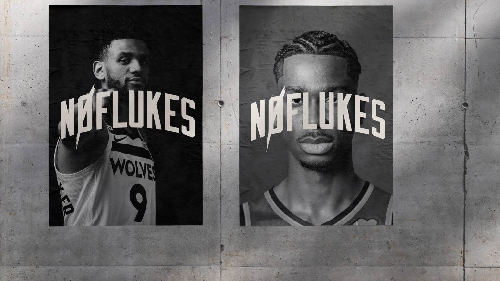
No Fluke hired me to refresh and elevate their brand kit to better reflect their evolving identity. I also worked with the team that oversees the overall brand presence. This included refining their typography system for better readability and consistency across platforms, as well as curating a modern, cohesive color palette that aligns with their brand personality. The updated brand kit provides a solid visual foundation for future marketing materials, digital assets, and overall brand identity.


THE GOAL
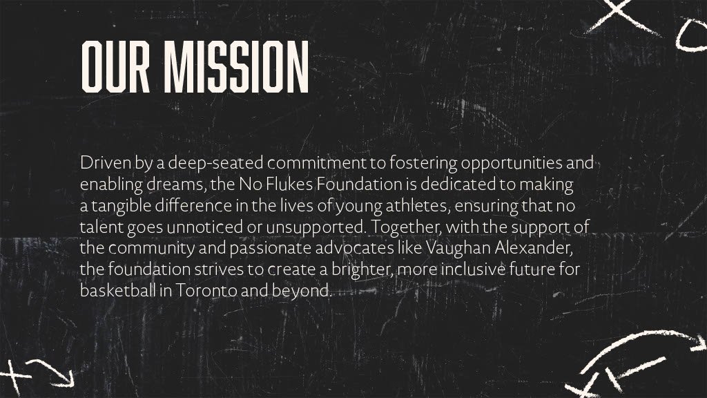
The goal is to refresh their existing brand kit with a modernized version that more effectively represents the company's core values through improved visuals and cohesive design